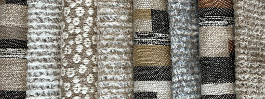
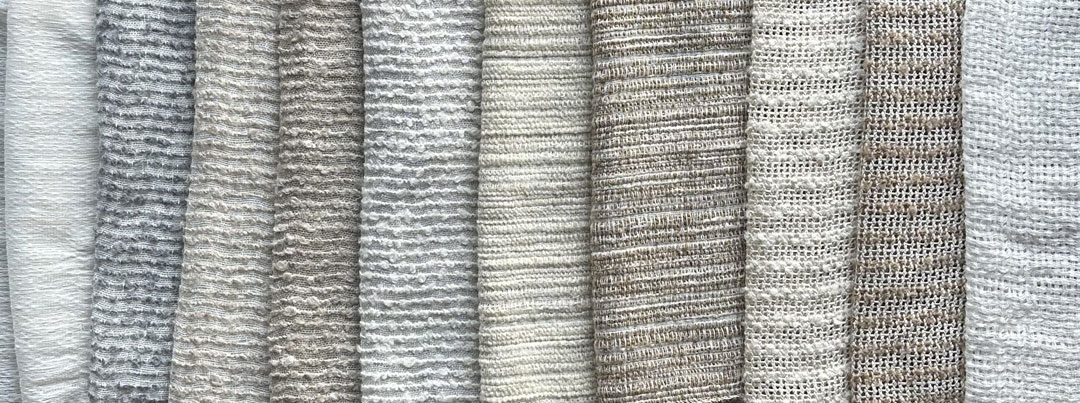
Harmonies by Karine Bonjean
At the core of our design vision, our harmonies can serve as a base upon which to build a space, or can serve to enhance a pre-existing concept. Evolution21’s wide range of fabrics have been combined into 40 distinct harmonies, in which styles and stories have been woven into. From exuberant and eclectic palettes curated with opulence and theatre in mind, to subdued yet elegant blends of colors and textures with versatility and usability at their core, Karine Bonjean has crafted them with all types of customers and clients in mind. Extra features, such as furs, leathers and fringes are also available to further embellish our harmonies, allowing you to have your own unique touch to your vision.
Whether you’re an architect seeking to find inspiration for a new project, or an individual who is looking for change in their space, these harmonies can offer an important stepping stone for visions of any size. Each harmony has a distinct story attached to them, taking cues from our world-spanning travels, architectural muses, and the rich heritage of the interior design world, presenting you with a narrative in which we aim to stir memories and aspirations.
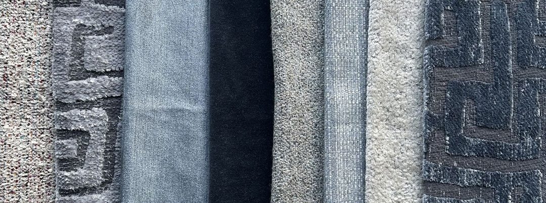
Harmony 1 – Sag Harbor Skies
Inspired by the blustery gales and the blurring of lines between sea and sky, our Sag Harbor Skies harmony is a textural representation of one of the most cherished locations in the Hamptons.
![]() restricted content
restricted content
Harmony 2 – Supplements
Fabric fringes and dreadlocks are elegant finishing touches used in high-end decor to enhance the texture and visual interest of items like cushions, curtains, and furniture accents. These finishes add a sense of sophistication and artisanal work, transforming simple designs into luxurious statements.
![]() restricted content
restricted content
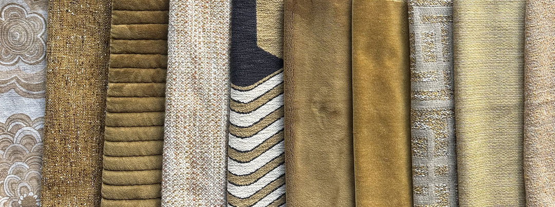
Harmony 3 – Spanish Hills Sands
With a tint reminiscent of the mountains which dot the Las Vegas skyline, our Spanish Hills Sands harmony brings the colors and textures of the Nevadan outdoors into your living space.
![]() restricted content
restricted content
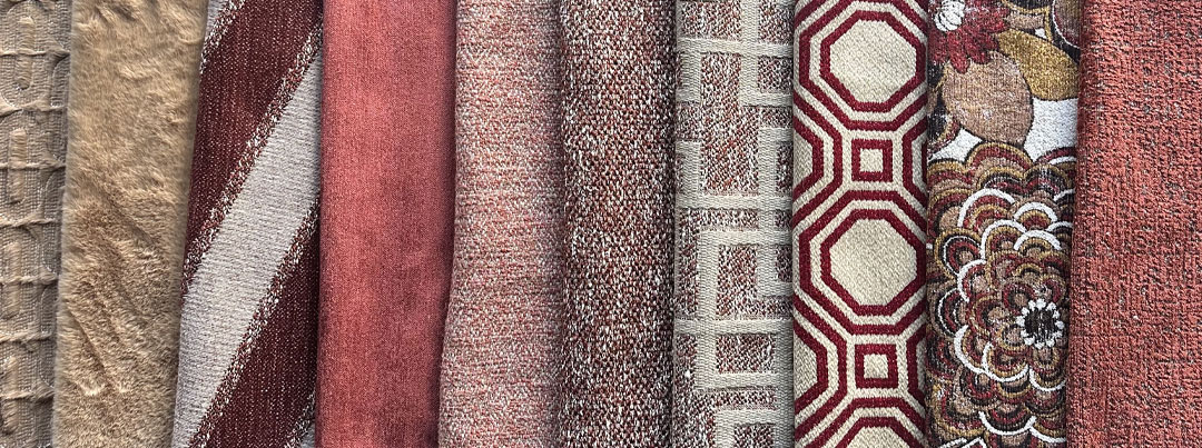
Harmony 4 – Gramercy Hues
Taking inspiration from the architectural diversity around one of New York’s most prestigious neighborhoods, our Gramercy Hues harmony references the mix of exposed brick and European revival styles which are commonplace in the area.
![]() restricted content
restricted content
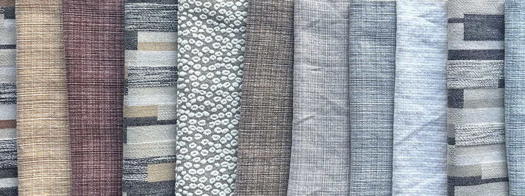
Harmony 5 – Bonzai Pots
Seen by Zen Buddhists as an object of meditation or contemplation, the bonzai tree is a delicate yet powerful reminder of one’s dedication to their craft. With lifespans that can span across centuries, they stand as proof to the rewards of patience and care.
![]() restricted content
restricted content
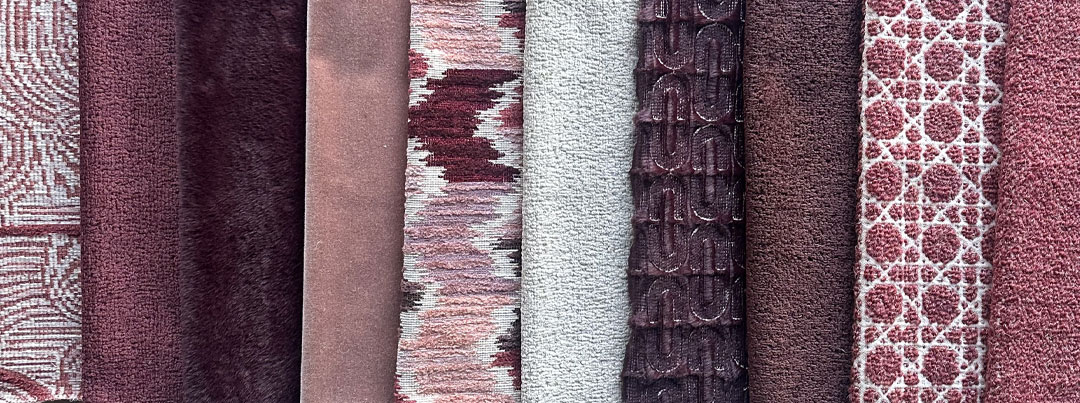
Harmony 6 – Soho Corners
Home to New York’s shopping district, Soho’s streets exudes refinement, all while preserving the charm and flair which radiates from the city. The curves of our fabrics and the harmony’s color palette reference its former industrial heritage.
![]() restricted content
restricted content
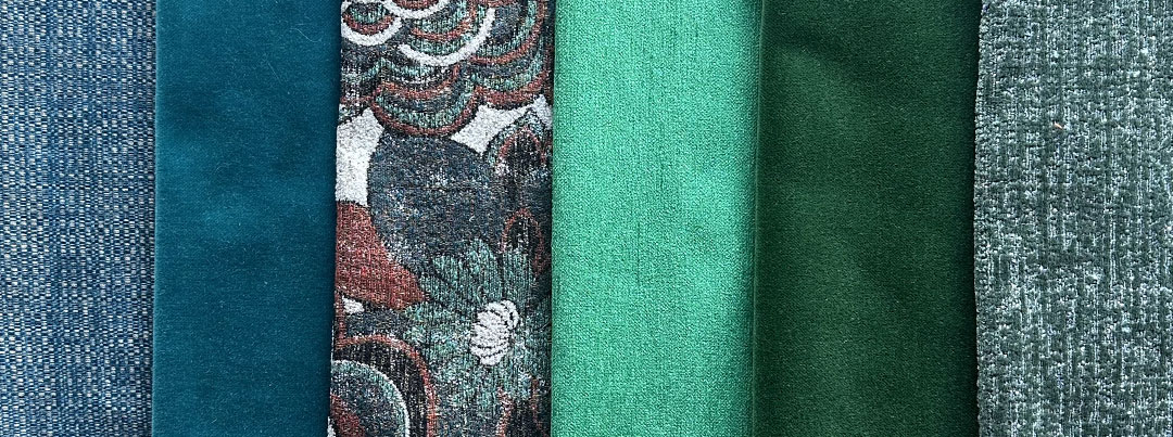
Harmony 7 – Cortina Peaks
As a gateway to the Dolomites, Cortina d’Ampezzo offers some of Italy’s most stunning views, nestled away at the top of Valle del Boite. With its myriad of textures, Cortina Peaks has versatility in mind.
![]() restricted content
restricted content
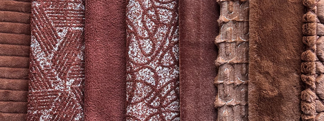
Harmony 8 – Vernazza Alleys
With its soft palette spread across its buildings, Vernazza has gradually become one of Italy’s most photogenic vistas. We can see this harmony suiting a warmer climate, backed up against bare brick walls or pastel-colored plasters.
![]() restricted content
restricted content
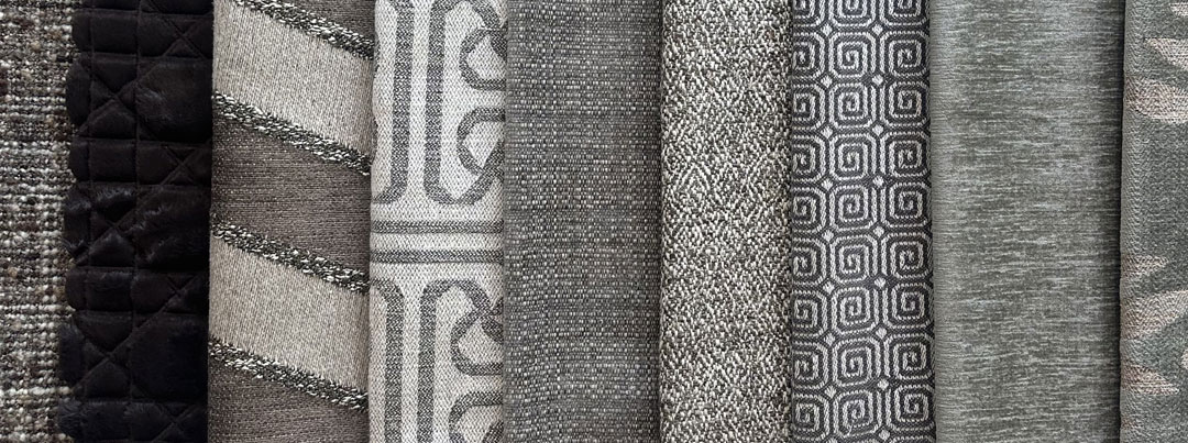
Harmony 9 – Fallingwater Flush
A reflection of Frank Lloyd Wright’s most notable project, Fallingwater Flush carries across distinct design cues from American mid-century architecture, whose popularity has only continued to grow in the decades since its inception.
![]() restricted content
restricted content
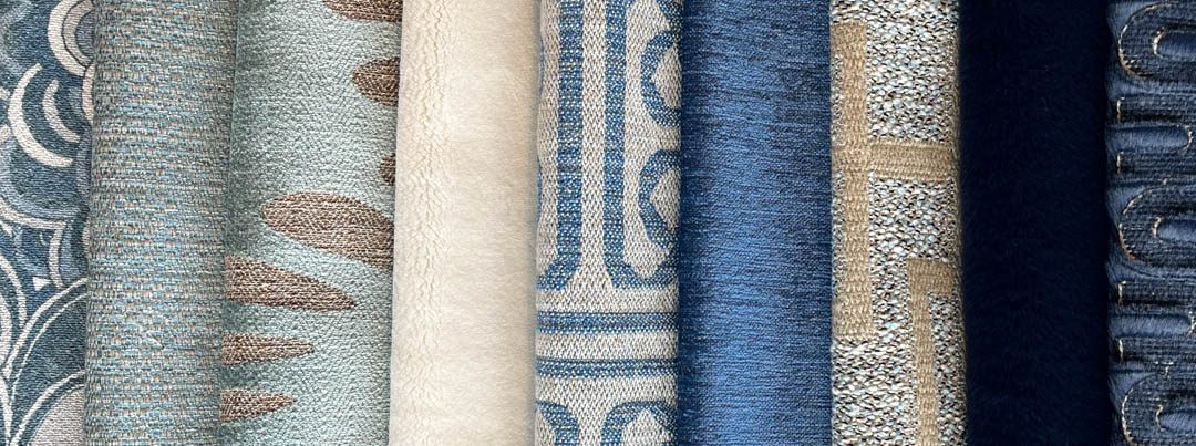
Harmony 10 – Miami Shores
Miami is deeply under appreciated for its architectural history, however much of it remains hidden within the city to this day. While keeping Miami’s nautical heritage in mind, we decided to take inspiration from Henry End’s personal Miami residence.
![]() restricted content
restricted content
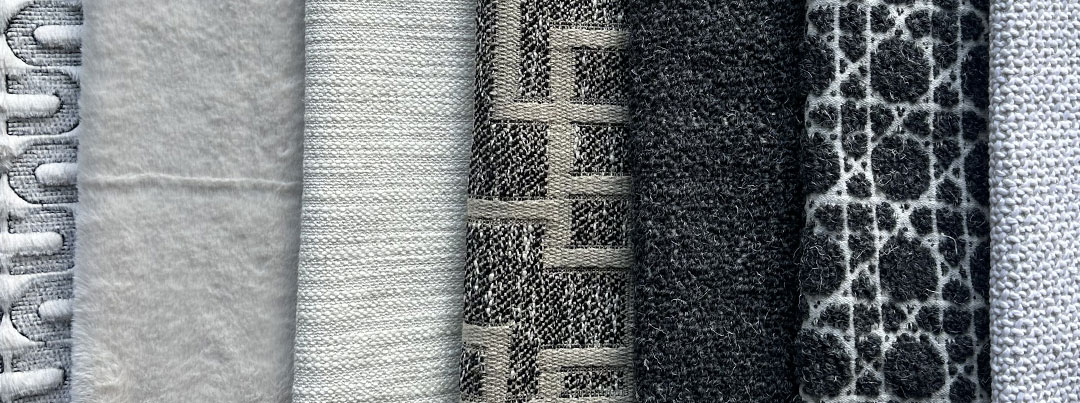
Harmony 11 – Tahoe Vistas
Inspired by the mountains which surround this iconic Californian ski resort, our Tahoe Vistas harmony brings the blend of exposed rock and deep powder snow which characterise a winter getaway
![]() restricted content
restricted content
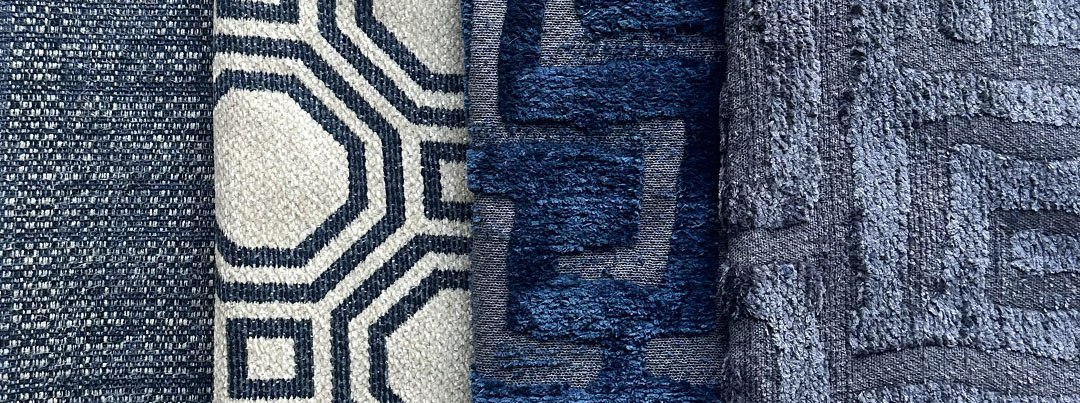
Harmony 12 – Roppongi Nights
A textural homage to the bright streetlights and dimmed office buildings of Roppongi, we’ve used our fabrics to illustrate this unique aesthetic and bring it into your own space.
![]() restricted content
restricted content
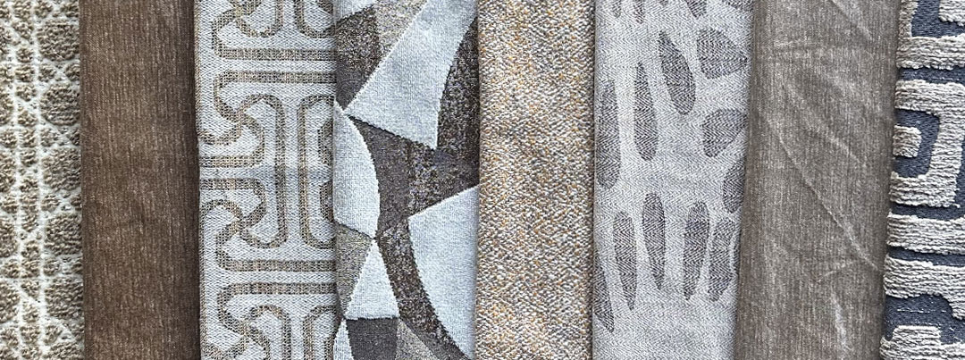
Harmony 13 – Alhambra Tones
With an intricate mesh between patterns and solid textures, Alhambra Hues is a reflection of Granada’s famous attraction, itself a mesh of its own between the elegance of a Moorish palace and its stable fortress foundations.
![]() restricted content
restricted content
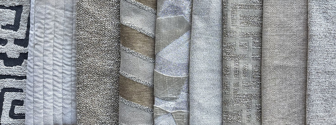
Harmony 14 – Joshua Tree Tapestry
The desert’s beauty has inspired this harmony, with its blend between distinctive and subtle motifs and non-patterned fabrics replicating the natural presence of its topography.
![]() restricted content
restricted content
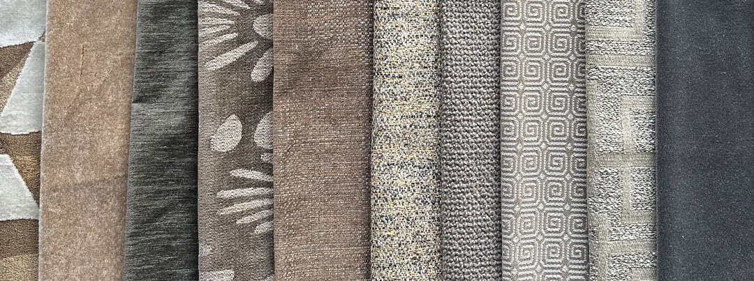
Harmony 15 – Barbican Lines
One of the most recognisable examples of British Brutalism, the Barbican Estate is an ode to London’s post-war rejuvenation. We’ve taken cues from throughout the estate, as its timelesness has permeated into the city’s aesthetic.
![]() restricted content
restricted content
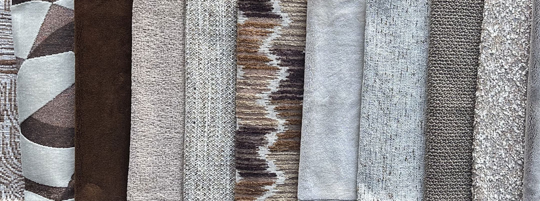
Harmony 16 – Cadogan Square Slabs
With distinct Flemish architectural influences, a small selection of 19th century architects have left a lasting imprint on this London neighborhood’s cachet. The carefully curated selection of fabrics allows you to create a space that is both stylish and steeped in heritage.
![]() restricted content
restricted content
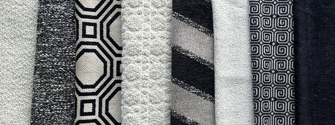
Harmony 17 – Carrara Contrasts
Carrara Contrasts is befitting of a grand space, one where its richness is defined by scale and opulence. Used as accents throughout a room or constructing an aesthetic around its fabrics, this harmony has the ability to adapt and shine in any environment.
![]() restricted content
restricted content
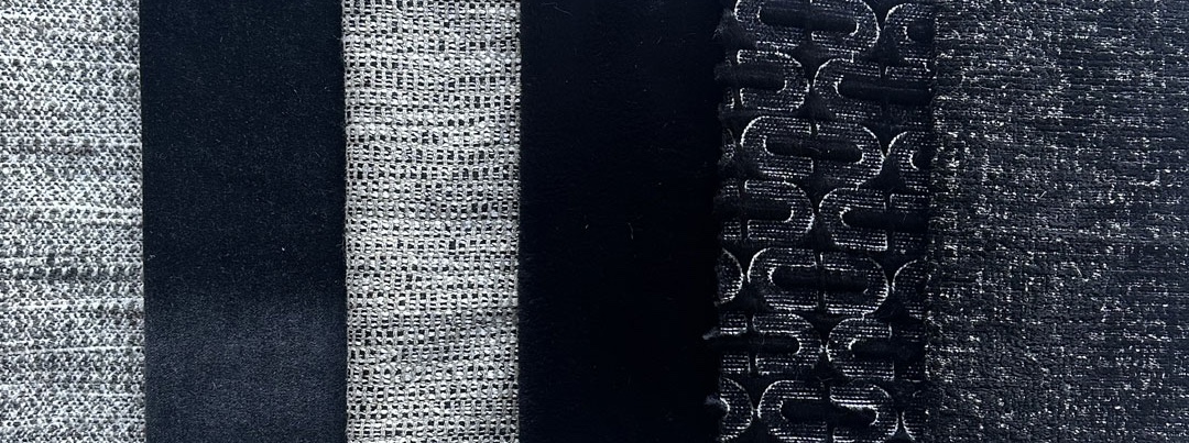
Harmony 18 – Zermatt At Dusk
As the shadows lengthen over the Swiss Alps, the winter light dances over its jagged peaks, presenting a striking picture of raw natural beauty. Zermatt at Dusk fits aptly in a winter environment, from American ranches to the chalets of Europe.
![]() restricted content
restricted content
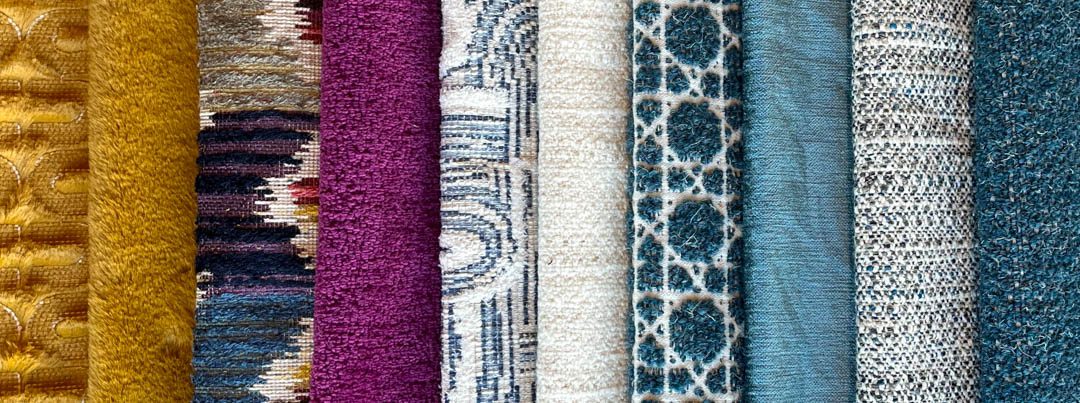
Harmony 19 – Havana Hues
Havana Hues has a warmth that makes it belong in a warmer climate. Contrasting with tropical foliage and wooden tones, its pop of color against the evergreen canopy of an island retreat lets the imagination wander.
![]() restricted content
restricted content
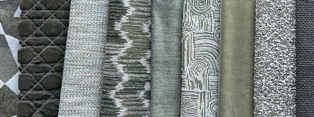
Harmony 20 – Vancouver Woodlands
With a symbiotic relationship between city and nature, Vancouver holds both ambition and tranquillity within its limits. We sought to reflect this dynamic through our fabrics, well suited for a cozy ambience.
![]() restricted content
restricted content
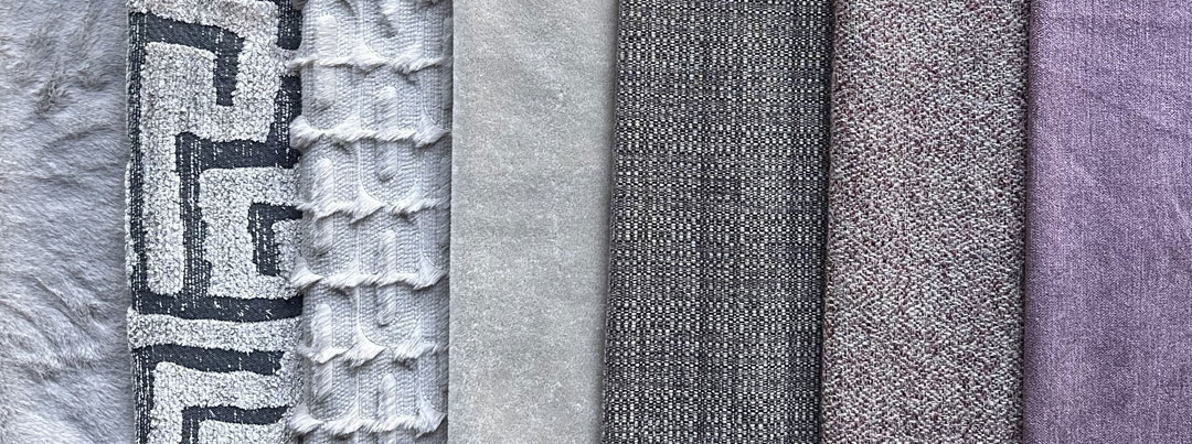
Harmony 21 – Lovag’s Bubbles
A nod to Pierre Bernard’s venerated project, our harmony takes inspiration from the colour palette of “Palais Bulles”. Overlooking the bay of Cannes, this structure is representative of Antti Lovag’s philosophy of “habitology”.
![]() restricted content
restricted content
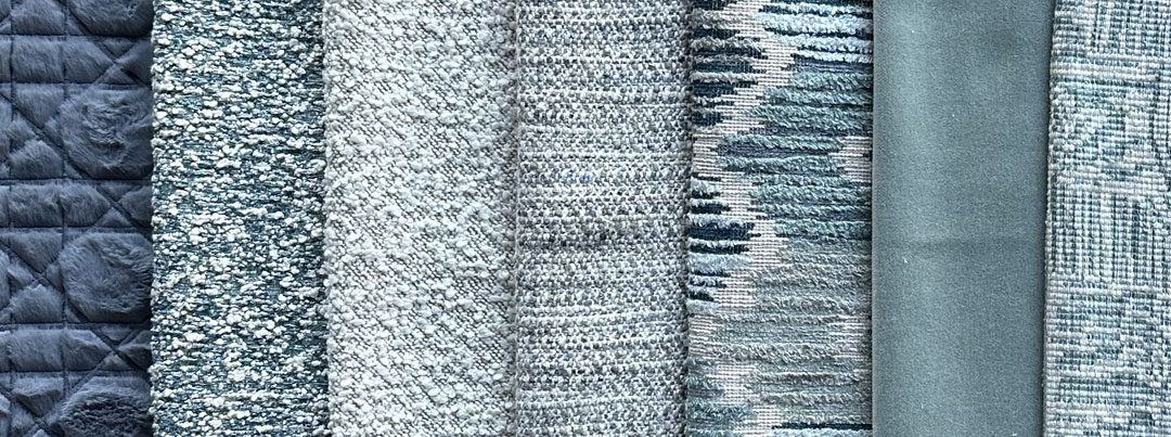
Harmony 22 – Belle Mare Ripples
Named after a stunning Mauritian beach, Belle Mare Ripples seeks to bring a tropical feel to your spaces. Based around a palette of soft blues, the harmony is reminiscent of the waters which surround the island.
![]() restricted content
restricted content
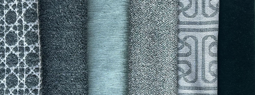
Harmony 23 – Ardennes Holt
A term from Old English, “holt” is used to define an area with a high density of trees. We chose to use this term in reference to an area of Belgium in which its nature and history have remained throughout the centuries; our Ardennes.
![]() restricted content
restricted content
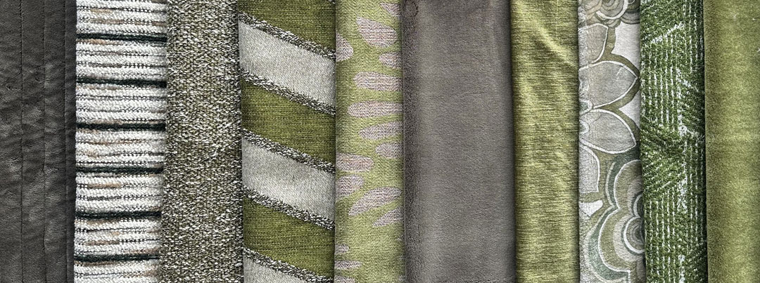
Harmony 24 – Newquay Crags
Newquay Crags serves as a reminder of British summer, with a lighter green tone suiting a space which backs upon greenery. In a classically British way, the harmony works well in a sunroom, as the glass brings in warmth year-round.
![]() restricted content
restricted content
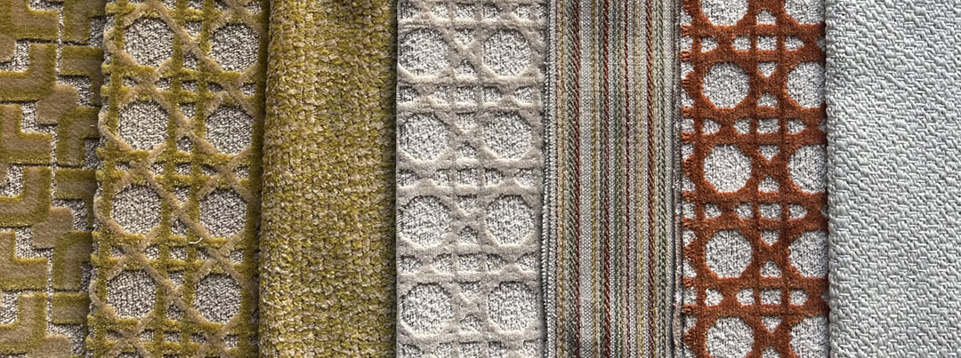
Harmony 25 – Botanical Kaleidoscope
Outdoor Harmony
As one of our harmonies which is tailored for outdoor use, Botanical Kaleidoscope uses organic patterns and a vibrant selection of colours to spruce up an outdoor space. We aimed to balance aesthetic appeal along with incredible durability, making this harmony suited for all-season use.
![]() restricted content
restricted content
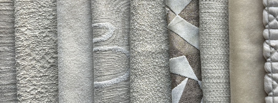
Harmony 26 – Nazca Lines
One of Peru’s historical wonders, Nazca’s geoglyphs represent the dedication and creativity of man when faced with incredible odds. Drawn into the sands over two millennia ago, it’s an incredibly powerful statement of humanity’s ability to leave a lasting mark which will outlive those who created it.
![]() restricted content
restricted content
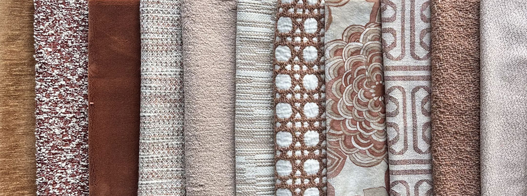
Harmony 27 – Autumnal Adirondacks
Autumnal Adirondacks has a focus on the specific shades which are associated with this change in seasons. The harmony leans heavily upon the rustic character of the Adirondacks, so additional pairing against rugged stone finishings are equally as tasteful.
![]() restricted content
restricted content
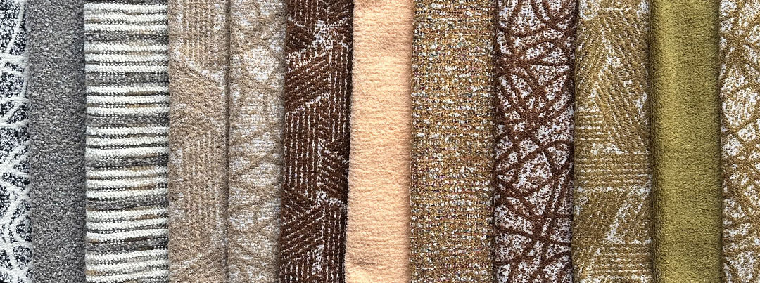
Harmony 28 – Boreal Allure
Outdoor Harmony
Curated with visual and material strength in mind, our outdoor harmony aims to bring a touch of sophistication to a setting, all while withstanding the weather of all four seasons.
![]() restricted content
restricted content
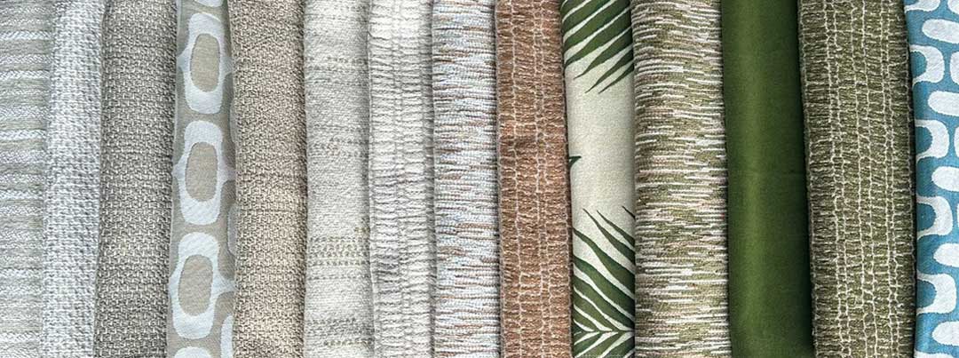
Harmony 29 – Tinghir Tints
Outdoor Harmony
An oasis tucked away amongst one of Morocco’s many valleys, Tinghir offers a glimpse of the region’s rich history through the longevity of its architecture. Its shapes and palette are referenced throughout this harmony as an acknowledgment of its growth from past to present.
![]() restricted content
restricted content
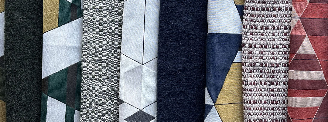
Harmony 30 – Farnsworth Creases
Our harmony takes inspiration from Ludwig Mies Van der Rohe’s pièce de résistance, Plano’s Farnsworth House. Its lines reflect the building itself, both inside and out, along with its surrounding environment.
![]() restricted content
restricted content
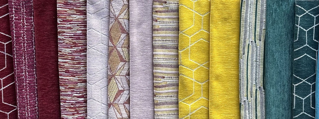
Harmony 31 – Maldivian Atolls
Outdoor Harmony
An assault on the senses, the colors and setting of the Maldives seem almost otherworldly, with its bright coral structures jutting up from the seafloor. The patterns of this harmony mimic their visual cues, bringing your outdoor space to life.
![]() restricted content
restricted content
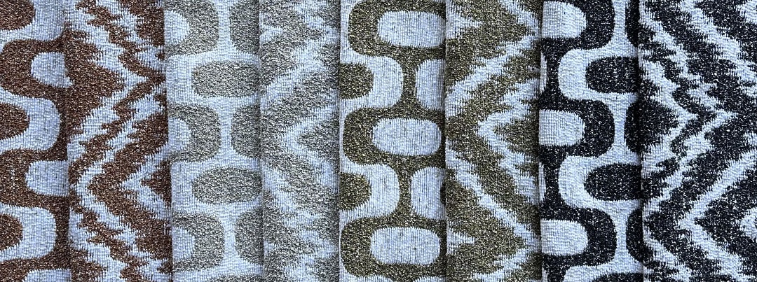
Harmony 34 – Balearic Tones
Balearic Tones takes its names from both of our patterned fabrics, Ibiza and Formentera. They are imbued with the soft tones and textures which are reminiscent of the aforementioned islands, thus presenting themselves as a vivid reflection of the typical European summer.
![]() restricted content
restricted content
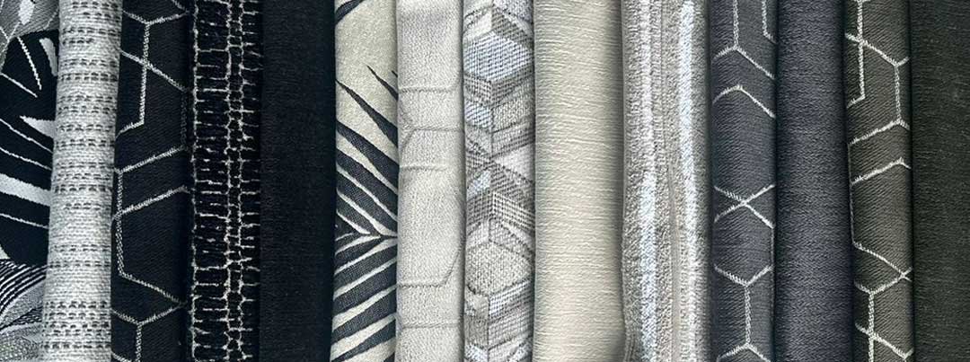
Harmony 35 – Tulum Tranquility
Outdoor Harmony
A vibrant reflection of the sights in Tulum, our harmony carries across elements of Mexican motifs, while remaining rooted in the natural splendor which the municipality has to offer.
![]() restricted content
restricted content
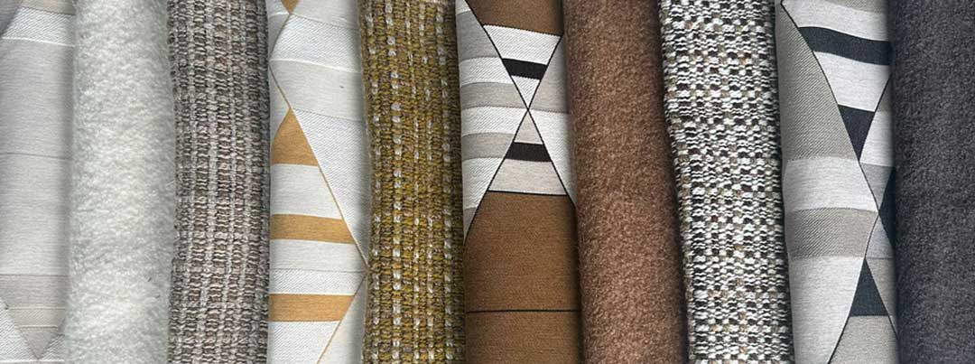
Harmony 36 – Walker Columns
An icon of the American Art Deco movement, the Walker Tower looms over Chelsea as a testament of New York’s rich architectural history. Therefore we have curated our harmony with timelessness in mind. His humanistic approach to design by creating a welcoming atmosphere for workers has been echoed through the motifs that we’ve chosen.
![]() restricted content
restricted content
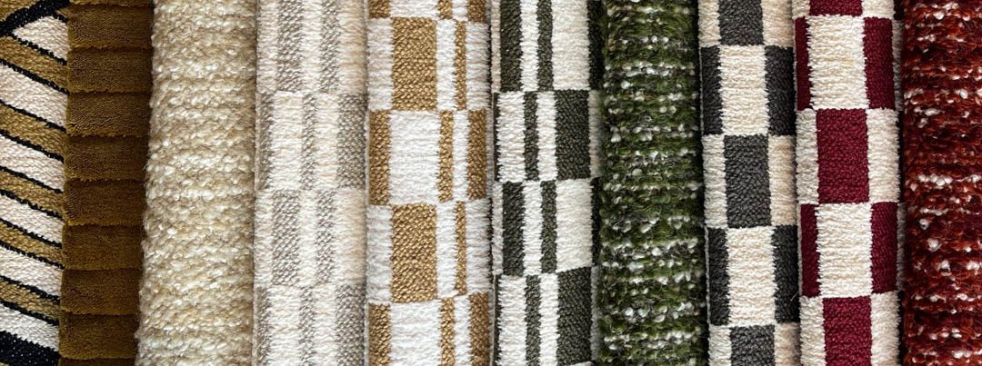
Harmony 37 – Vinicunca Slopes
Known as the “Montaña Arcoíris”, the “Rainbow Mountain”, Vinicunca is one of Peru’s most impressive vistas. The harmony focuses on the mountain’s respective mineral deposits, from the reds of rust to the greens of chlorite.
![]() restricted content
restricted content
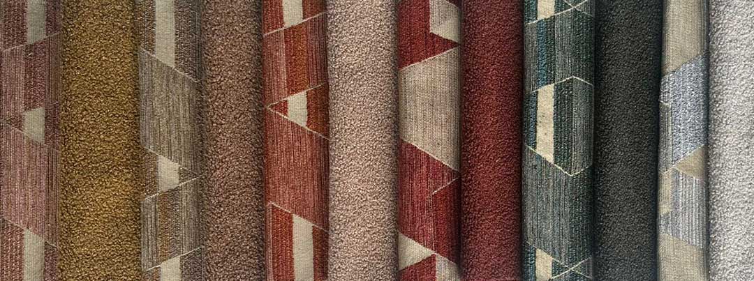
Harmony 38 – Horta’s Tapestry
Arguably the face of Belgium’s Art Nouveau movement, Victor Horta’s work throughout Brussels has served as the inspiration of many. Our harmony is tied together in its palette, sharing a similar tint to the colours used in “sgraffito”.
![]() restricted content
restricted content
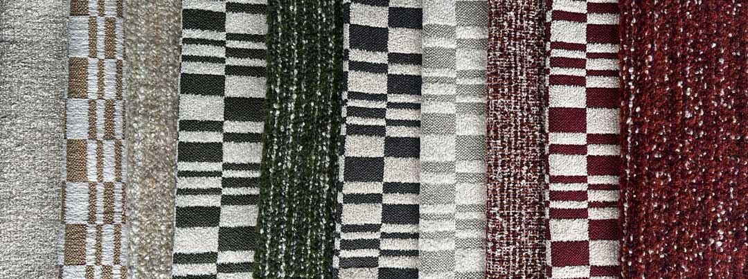
Harmony 39 – Corsican Coasts
Lacking any form of large city, Corsica is a retreat from the hustle of everyday life, a chance to slow down the mind and enjoy the present. This harmony would be welcome in a more eccentric room, full of brighter colors from the 60’s or 70’s era of excess.
![]() restricted content
restricted content
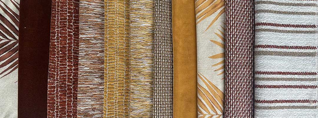
Harmony 40 – Uluru Undulations
Outdoor Harmony
Towering above the surrounding landscape, its sandstone composition is mixed with iron oxide, giving it its characteristic reddish tint. Curated primarily from a palette of coppers, lighter browns and various shades of white, our harmony reflects its natural hue.
![]() restricted content
restricted content
